161
In the rapidly evolving world of e-commerce, customer expectations have gone beyond simple transactions. They now seek experiences—personalized, tailored, and intuitive. Product customization has emerged as a leading solution for e-retailers to meet these expectations.
PrestaShop, known for its flexibility and open-source power, offers a fantastic array of features that cater to both developers and store owners. One such underrated but incredibly valuable feature is its ability to enable personalized shopping through product customization.
As e-commerce transitions more deeply into the mobile-first era, delivering custom products that adjust to individual preferences across all device types becomes crucial. This is where responsive design and personalization intersect.
In this blog, we’ll explore how to implement product customization PrestaShop offers, why it matters in today’s mobile-first digital space, and how tools like a Product designer PrestaShop module can drastically improve the user experience.
Why Personalization Is the Heart of Modern E-commerce
- Personalized shopping is no longer a luxury; it’s expected. From engraved names to custom colors, modern consumers want the ability to shape products to their liking.
- This need is magnified when browsing on mobile devices. A mobile user needs a smooth, responsive interface that allows easy customization without frustration or lag.
- Product customization adds value by making customers feel in control. When you integrate customization into your PrestaShop store, you tap into this psychological driver, often increasing both engagement and sales.
Responsive Design: The Foundation of Seamless Customization
- We live in a mobile-first world, where over 50% of internet traffic originates from smartphones and tablets. That means your store’s ability to deliver seamless customization must be just as strong on a phone as it is on a desktop.
- Responsive design allows your PrestaShop product customization interface to adapt to different screen sizes. If customers are unable to design or personalize products on their phones, you risk losing them.
- Ensuring that customization tools—such as color pickers, text fields, and preview windows—are mobile-friendly is a must. PrestaShop’s modular design makes this achievable without rewriting your entire site.
Steps to Enable Product Customization in PrestaShop
- Enabling product customization is simpler than it seems. PrestaShop comes with built-in customization features for product pages. Here’s how to activate them:
- From your admin dashboard, go to Catalog > Products, then click on a product you want to allow customization for.
- Navigate to the “Options” tab. There you will find a “Customization” section where you can add custom fields such as text inputs or file uploads.
- You can define how many text fields or file upload areas should appear and label them accordingly (e.g., “Upload your image,” “Add your name”).
- Once saved, these fields appear on the product page, enabling customers to personalize items before adding them to their cart.
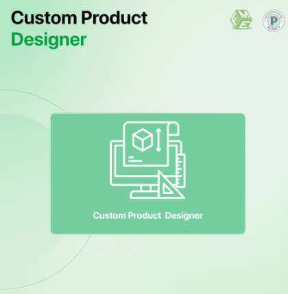
Leveraging Product Designer PrestaShop Modules
- The built-in features are functional, but if you aim for advanced customization, then third-party modules are indispensable. This is where a Product designer PrestaShop module becomes invaluable.
- These modules offer more interactive tools such as drag-and-drop text, live previews, and image layering—all designed for both desktop and mobile experiences.
- You can allow customers to design mugs, t-shirts, business cards, or even phone cases in real time, directly from their phones or tablets.
- Most advanced modules are built with responsive interfaces, allowing them to adjust perfectly to smaller screen sizes without losing usability.
Clean URLs and Customization: Making UX Smoother
- As with any modern e-commerce approach, clean and friendly URLs are essential. When adding product customization to your PrestaShop store, ensure your URLs remain readable.
- Instead of long, parameter-filled links, opt for clean structures like:
- ❌
www.example.com/index.php?id_product=91&controller=product - ✅
www.example.com/custom-engraved-tumbler
- ❌
- Not only do these URLs improve navigation on mobile screens, but they also boost your SEO rankings. They are easier to share, index, and understand—for users and search engines alike.
Mobile-First Indexing and Its Connection to Customization
- Google’s shift to mobile-first indexing means that the mobile version of your site is now the primary version used for crawling and ranking.
- If your product customization options are clunky or broken on mobile, Google will take note—and it can impact your rankings negatively.
- A mobile-friendly customization tool ensures that your site doesn’t just function on mobile—it thrives. Users get what they need, Google sees optimized performance, and your conversion rates improve.
Speed Optimization: A Must for Mobile Customization
- Customization tools often involve heavier scripts, real-time previews, and dynamic inputs. All these can slow your site down—especially on mobile networks.
- To mitigate this, always optimize your code, compress images, and use lazy-loading techniques for previews and custom files.
- A fast, responsive design ensures that your product customization process doesn’t deter users with loading delays or lag.
Testing Customization Across Devices
- Before rolling out your customization options, test them thoroughly. Use tools like:
- Google’s Mobile-Friendly Test
- BrowserStack for cross-device testing
- Lighthouse for performance audits
- Make sure buttons aren’t too small, inputs are easy to tap, and previews load correctly on all screen sizes. This step alone can prevent major bounce rate issues.
Structured Data and Customized Products
- Use structured data to highlight customized product options. This helps search engines understand that a product has additional interactive elements.
- When rich results show previews or customization options directly in search results, your click-through rate can improve drastically.
Best Practices to Follow
- Use PrestaShop themes that are specifically optimized for mobile and customization-heavy pages.
- Make sure the customization experience doesn’t interfere with checkout or add unnecessary complexity to your funnel.
- Display previews in real time wherever possible—users want to see how their customizations look before buying.
Future of Product Customization in a Mobile-First E-Commerce Landscape
- As tech advances, AI-driven customization and 3D previews are becoming more common. Ensuring that these innovations remain responsive and mobile-friendly is key.
- PrestaShop’s community and marketplace continue to roll out powerful modules and themes tailored to this trend, giving you the tools to stay ahead.
Conclusion
- In a world where mobile users dominate e-commerce traffic, the ability to offer seamless, intuitive, and responsive product customization can set your store apart. If you run a PrestaShop store, integrating these features is no longer optional—it’s essential.
- By enabling the product customization PrestaShop supports and investing in a solid Product designer PrestaShop module, you empower your customers to create meaningful, personalized experiences.
- This not only enhances engagement and loyalty but also significantly boosts your chances of conversions—particularly in the fast-paced, mobile-first era of shopping.
- globblog